Member-only story
Better Flutter Menu
Flutter’s popup menu needed improvement
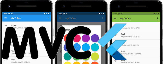
I never liked Flutter’s popup menu. It’s ugly. It’s a block of white in the corner of the screen. Does it have to be just a square like that slapped on top of the AppBar? It doesn’t look good. It looks amateurish. Why can’t it look more like the menu below on the right-hand side? That’s a little better.

The Clutter of Flutter
Another thing I don’t like about Flutter’s popup menus is the clutter. I hate the ‘Flutter clutter!’ You know what I mean. I suspect, when you were first learning Flutter, you too had to get used to those long vertical lists of parameters. Many widgets have long lists of parameters, and the widget, PopupMenuBotton, is no exception.
It lists its menu items, of course, but it also lists the settings on how the menu should appear — assigning those settings, by the way, you’ll get the ‘better appearance’ as seen in the screenshot above — at least that’s readily available. However, it also can list its anonymous functions making the clutter even longer. I mean, you don’t even see the popup menu until you tap on those three little dots in the corner of the screen, and yet its code can take up half the build() function. See below. No sir! I don’t like it.


